Learn more
WORDS-HURT
WORDS-HURT
Overview
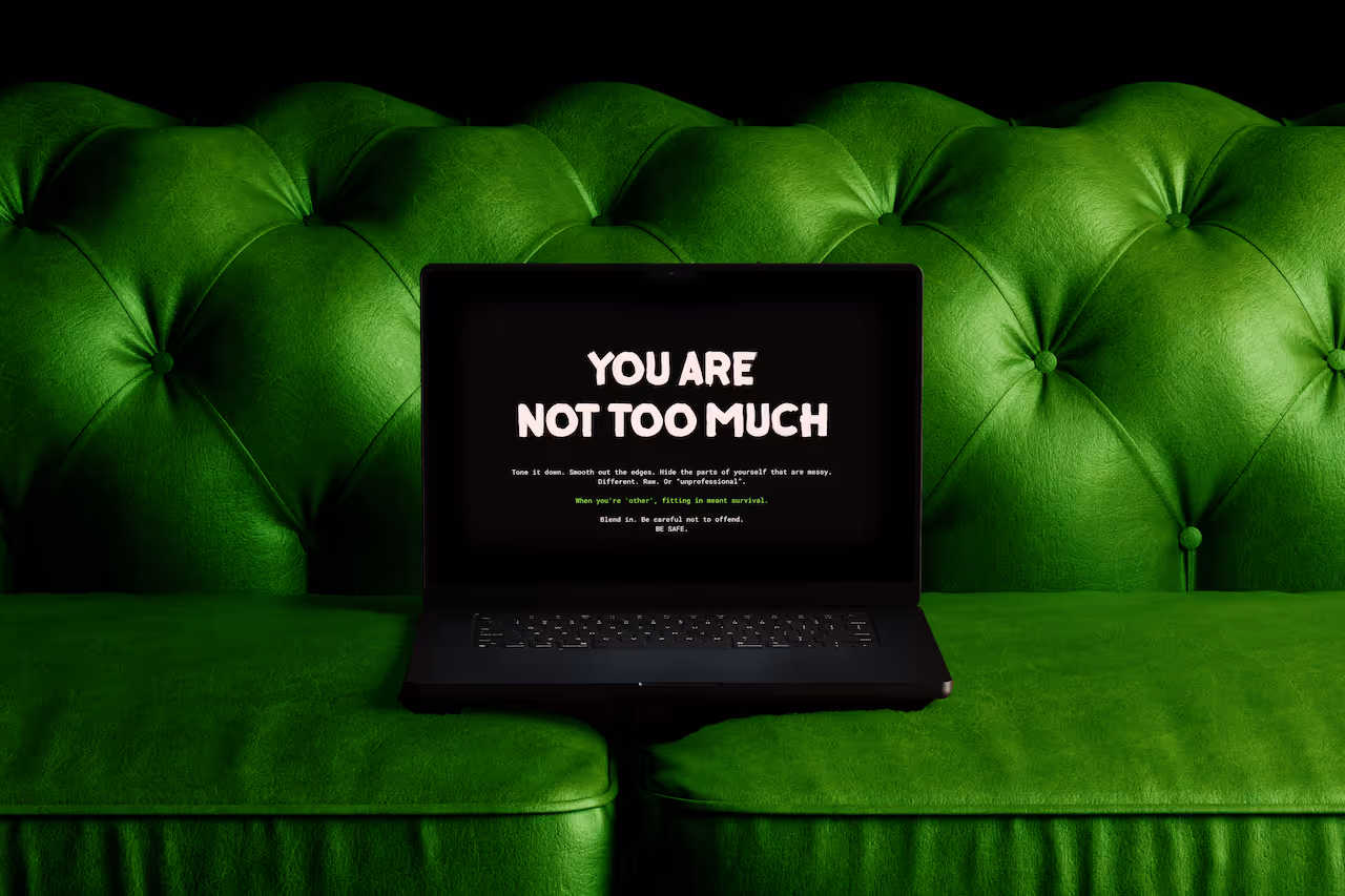
So you're a ex-theatre director turned creative director and copywriter. Your brand is literally called WORDS HURT. You write copy that makes people feel things. Uncomfortable things. Real things. You're not here to play it safe. You're here to flip the bird at every "clean, minimalist, safe-for-consumption" box the industry tries to shove creatives into. And yet? You don't have a website.
%20-%20GIF.gif)
The Challenge
Here's what the founder told us:
"I didn't have a website and I really started noticing how many opportunities I was losing because of that, and how much time I was wasting by explaining things in DMs over and over again instead of having a home for my brand. I was tired and always burned out."
Burned. Out.
Because when your brand is this intentional, this different, you can't just slap up a Squarespace template and call it a day. It has to be perfect. It has to be it.
And here's the thing about being a multi-talented creative who does everything yourself (visuals, copy, strategy, social media), you become incredibly protective of your work. Especially when most people don't understand what you're trying to say.
The real challenge wasn't just "I need a website."
It was: "I need someone who gets what I'm building and won't water it down."
.gif)
%20(2).gif)
Our Strategy
Our first call? Electric.
"It took me so long to hire someone because I really needed my website to be perfect, and I was used to doing everything myself. I'm very protective over my material and due to the nature of my brand, a lot of people don't 'get it', and I needed a team that got exactly what I was trying to say & create."
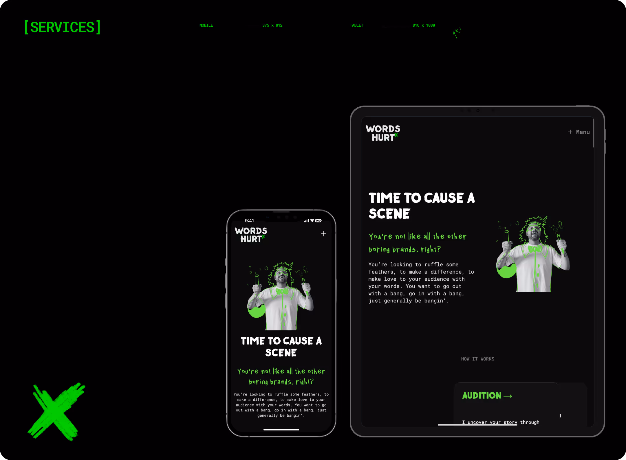
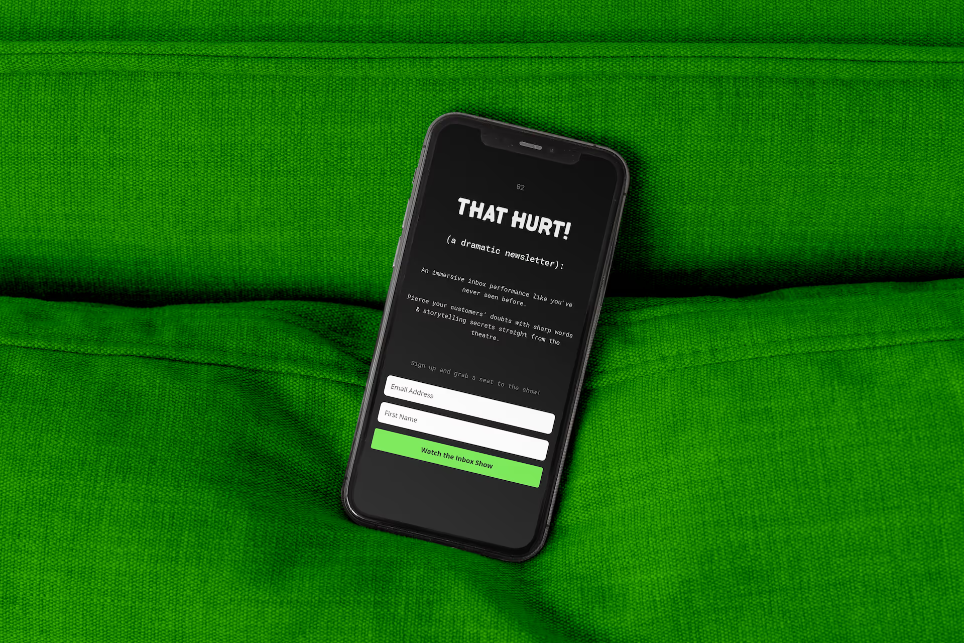
We weren't just designing a website. We were creating a theatrical experience.
Because that's what Words Hurt deserved a digital stage where every word and every visual worked together to tell a story.
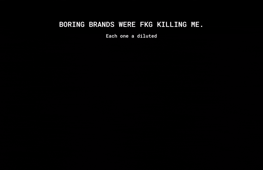
Here's how we brought the rebellion to life: We let the copy lead (because duh)
The founder's story is theatrical. Ex-theatre director energy literally coursing through every sentence.
So we built the design to support that narrative.
We created pauses where story demanded people to focus. Dramatic moments. Space for empathy. Strategic navigation that guided users deeper without breaking the experience.
The design wasn't there to stand out. It was there to amplify the words.
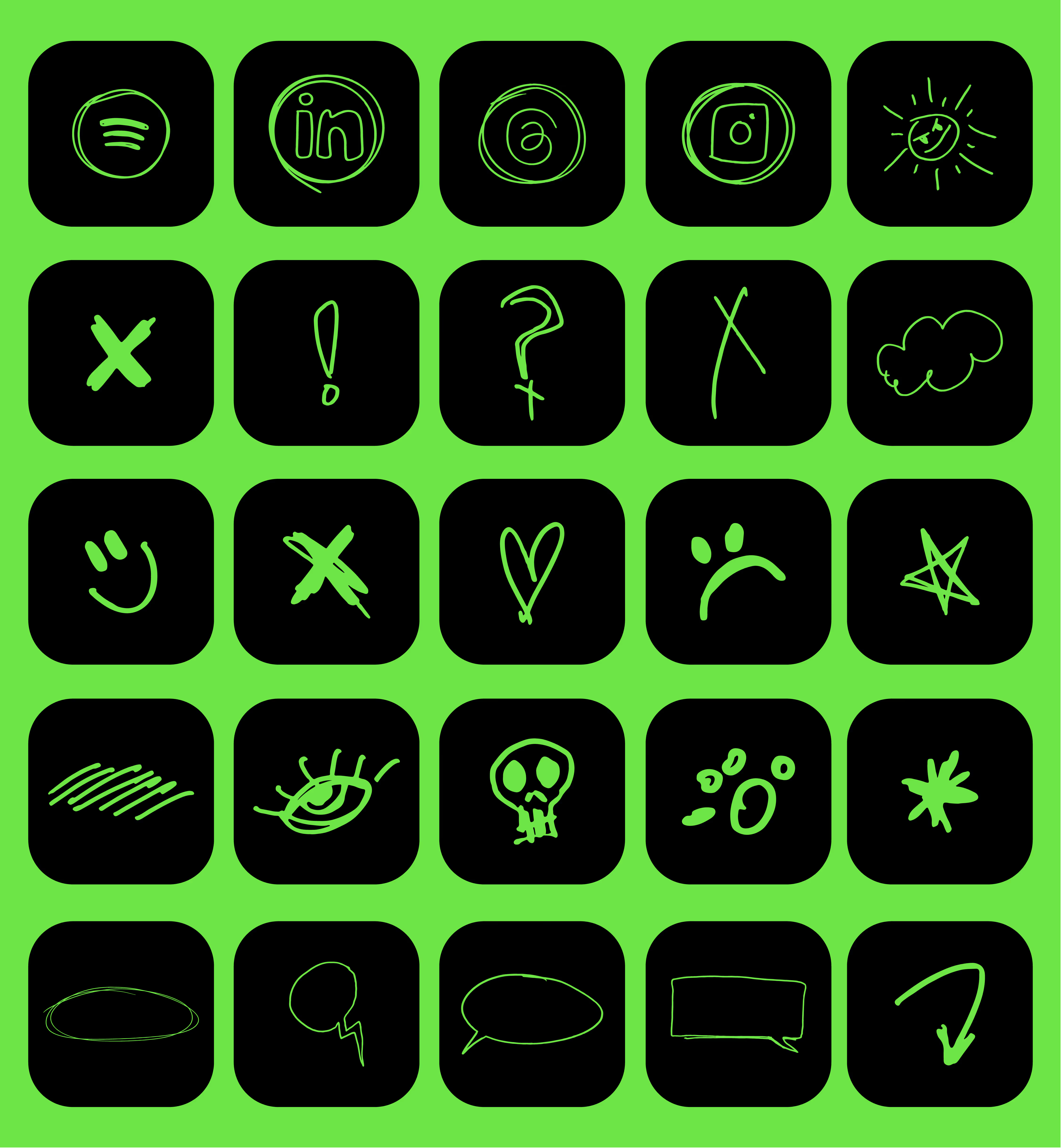
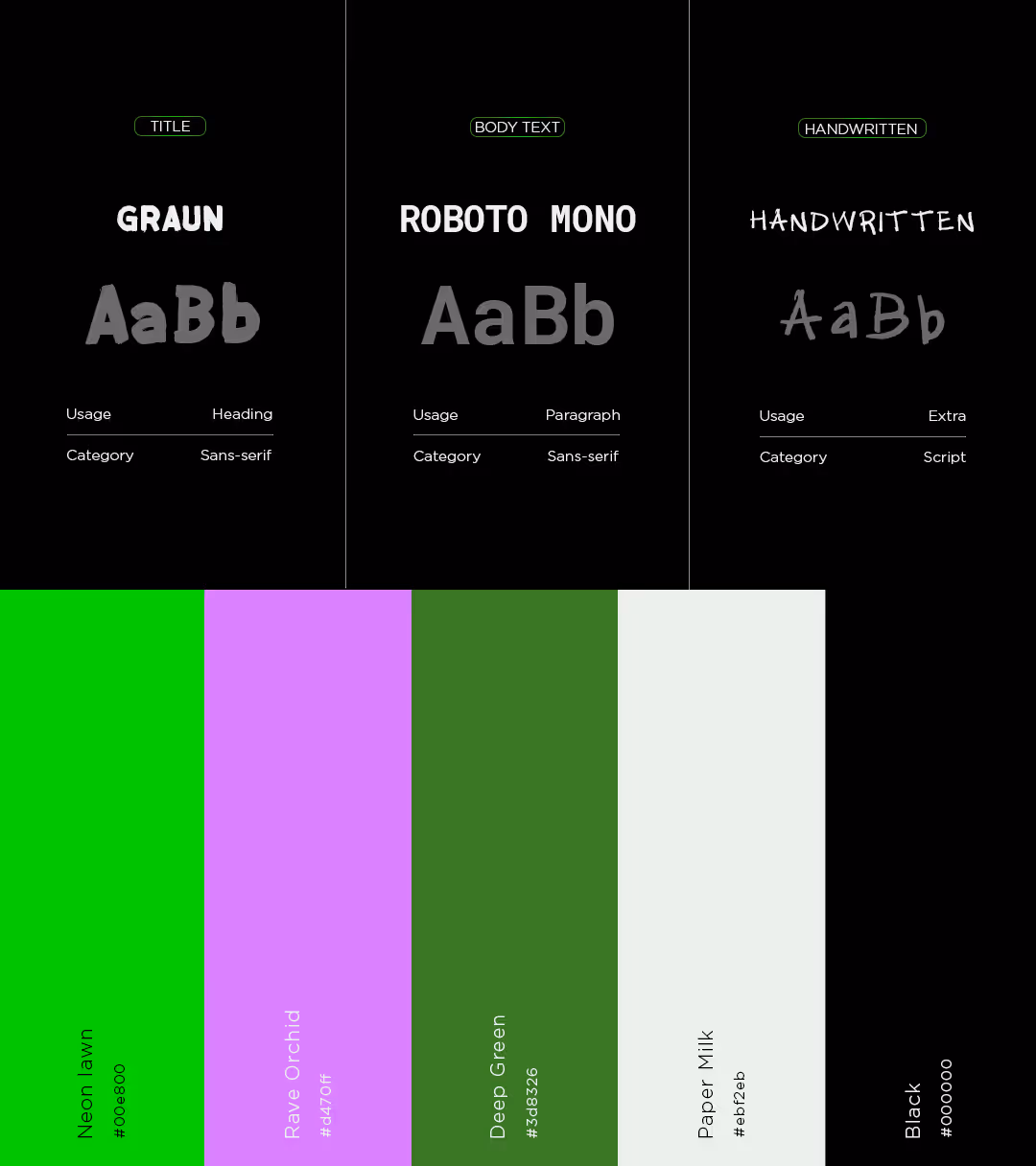
We embraced the dark side (literally)
Retro shades of green. A dark theme. This is not exactly your typical "creative portfolio" aesthetic.
And then finding inspiration for a bold, creative website that's also dark-themed? Tricky. But that constraint became our playground and we had so much fun with it.
We mixed typography styles, including a handwritten font created by the founder himself. We added hand-drawn scribbles. Like a copywriter leaving cheeky notes for the reader. Little surprises that felt personal and playful.
The whole vibe screamed: "This isn't your corporate copywriter's portfolio. This is a stage. WELCOME TO THE PERFORMANCE."
%20-%20Compressed.avif)
The Outcome
What Happened When The Curtain Went Up
Launch day hit different. "It's only been 1 day since launch but I already feel so much more confident and legitimate as a business owner. It feels great for my business to have a real home outside of Instagram." One day. And the founder already felt the shift. Not just "yay, pretty website." But legitimate. Confident. Like their business finally had a home that matched the fire they bring to every project. Now? The website filters out the "safe" brands and attracts the underdogs, the underestimated, the ones ready to make a scene.
Client Notes
"Kanza translated my crazy ideas into real tangible website things that WORK! It was the perfect website I was dreaming!!"
Kalyl Kadri