Learn more
I received 180+ applications for a UI/UX designer role last month. And yes, I went through all of them.
Only 35% sent their portfolio as a website instead of a resume stapled to a long text-y pdf. That alone was a good first impression. You earn bonus points just by making it an experience to scroll through your work instead of sending a static file.
But as I kept going over emails after emails, a pattern showed up fast. 90% of the portfolio websites were templates. This is not a knock on template websites (they exist because they work). The problem was what people were pouring into them.
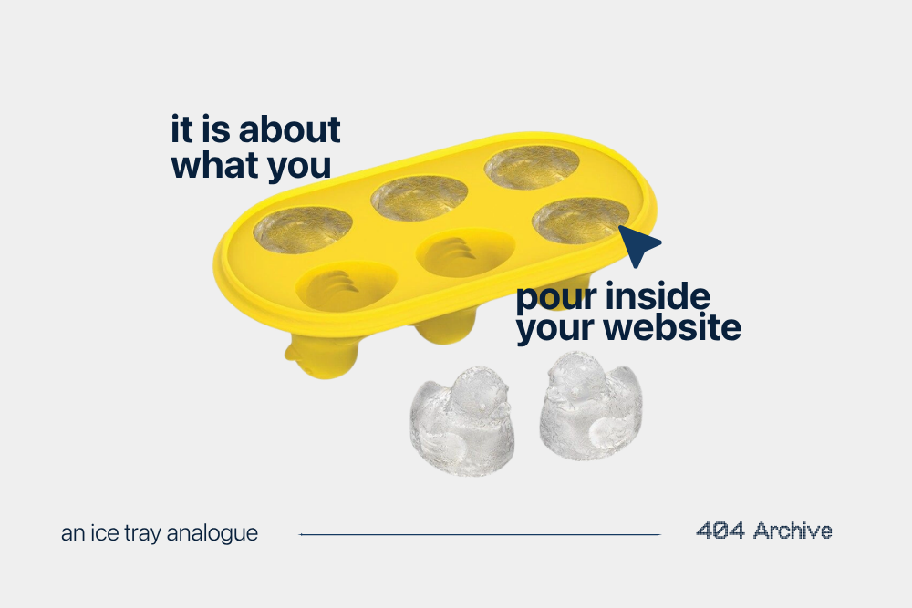
Templates are an ice cube tray. Different molds, different shapes, and it does not matter which one you pick if you have not decided what you are actually pouring inside it. Remember those Instagram videos that used to go viral about a woman showing her 50 types of ices shapes and flavors for different drinks. (my brain rot algo might be niche).
So what are you pouring inside your website?
Identity > Job Title
Most people open with “I am a UI/UX designer,” paired with a hero image that has nothing to do with them. And I get it. But I am looking at dozens of people applying for the exact same role.
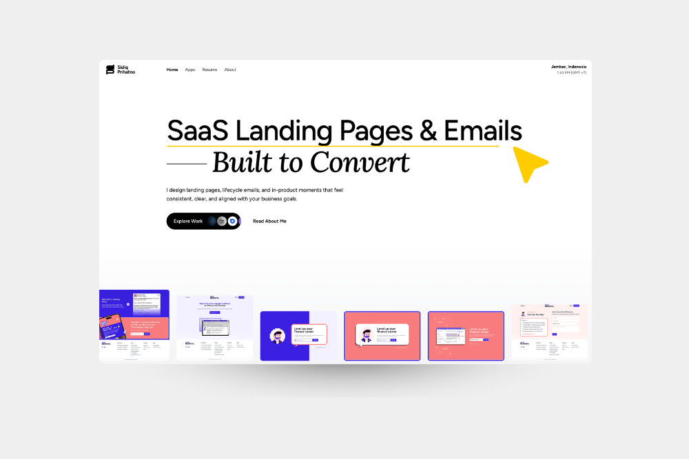
If your website does not hook me with exactly who you are in the first few seconds, I am not deciding you are wrong for the job. I am just not deciding anything at all, and I move to the next option.
Whatever makes you specifically you needs to show up before I scroll.
Here is what that actually looks like instead of a job title next to a stranger’s face. Specific enough that the right person knows within 3 seconds that you might be the one:
Your hero tagline is the hook of who you are, beyond your job title.
Job titles are fluid. You could be a ui/ux designer, a web designer, an app designer, a product designer. Nobody is deciding based on the label. I am deciding based on how you can help me.
Narrate The Work, Don’t Link To It
The second thing that separated people fast: talking about what part did you actually play in the work you are showing on your portfolio!!Do not just link out to a Figma file or a live site. Talk about the work. Pair it with visuals and make it something the users want to engage with, not something that they just have to go verify.
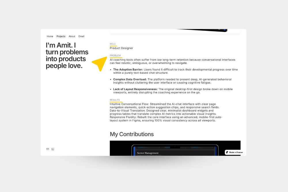
I was running into broken links, generic mockup images, Figma files that started to blur together by the fortieth one, Behance portfolios that showed me the final screen and never once told me how they got there. I did not need the file without any context. I needed to understand how you think.
So if you are adding your work, here is what it actually needs:
The applicants who told me the decision behind a screen, not just the screen itself, were the ones I still remembered.
Make It Yours, Then Make It Easy
You have about three to ten seconds before someone decides whether to keep going or close the tab. If your website shows your personality in that window, it becomes your first sales pitch. It is the first impression of your taste and personality.
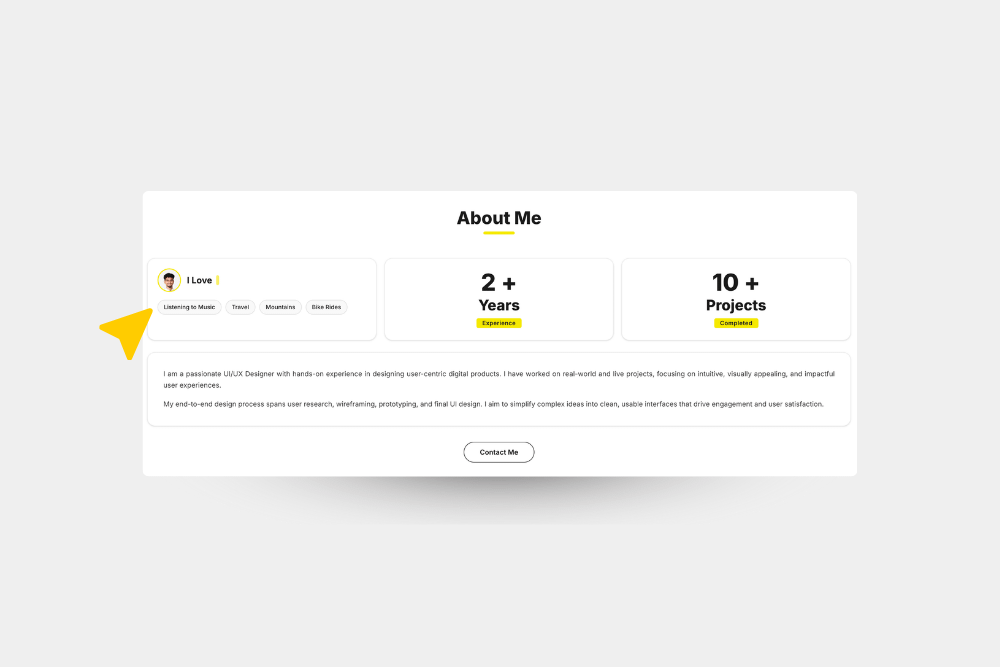
Most people overcomplicate this part. It really just means making the site feel fun, feel like you:
This is the part you should enjoy the most. You are finally using your ice cube tray to make the drink you would actually want to drink.
Then last step is to make the next action obvious. Give them one main action that would matter. Follow you on LinkedIn, book a call through Calendly, an email address that is easy to find. They should not have to hunt for how to reach you to work together.
A lot of people get caught up in a personalized domain or a unique design and completely miss the part that actually matters. Nobody is closing the tab because your URL was not custom enough or design trends.
It is about how easy it is to make a decision to hire you. And your website makes it easy to answer some important questions before an interview call.
If you have a portfolio site right now, I would genuinely like to know: what is the one thing on it you are still not sure works? Hit reply, I read every one.
I’m Kanza. I run NVRMND Studio. We build websites for founders and studios who are ready for their online presence to actually match the work they’re doing. This newsletter is where I think out loud about strategy, design, and what it really takes to build something worth building.
P.S. I’m rooting for you. Always ✨

.png)
%20(1).png)